Extraordinary images with ‘ordinary’ people!

After a HUGE amount of deliberation and some soul searching, I recently launched a creative portrait package.  The deliberation was down to the fact that the Surrey Hills is not exactly a hot market for portraits that go way beyond headshots.  This isn’t London, or Brighton and while people here love their family photography and the business photography market is booming – I’m not sure they will be bashing the door down to get ‘interesting’ in the studio.

creative portrait

BUT – in the end I figured there was no harm in launching something – kind of a ‘if you build it they will come’ sort of thing.  I’ll keep you posted on how it goes, but the early signs are promising.

What I wanted to share with you here is the shoot that started me off thinking about all this.  I wanted to try something big, something really creative and something collaborative.  At Halloween last year I got my first taste of this kind of thing with the Lilith shoot (check out this shoot over at my Spark page) and honestly I had such an amazing time I wanted to do it all over again!  I have always loved dressing up, both in the glamorous evening wear sense and in the fancy dress sense (that’s costume for my American readers) but I love the piecing together of an outfit, the concept, the finding of unique pieces and the creating a look almost as much as I love wearing the things!

_MG_1641-Edit
Image from Lilith – Halloween 2017

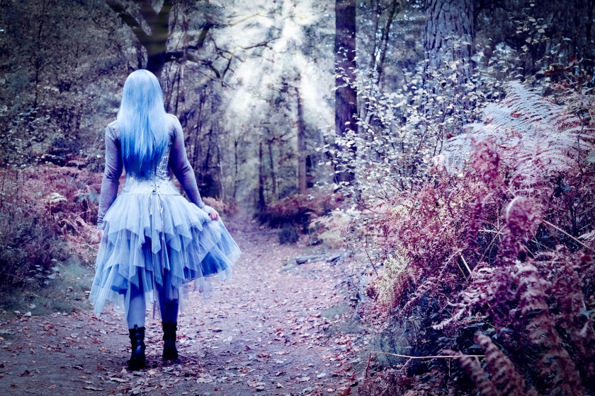
I’d been trying to persuade my friend Chantal to model for me for a couple of years but she wasn’t really having it until I presented her with this particular idea which would only work the way I wanted with a model that looked just like her (honestly it wouldn’t have been anywhere near as good without her golden skin and black hair – it just wouldn’t!).  Having convinced her I set about gathering others to help with the set, the styling and the makeup and the result is what you see here – Violet and Gold!

The key thing here is that Chantal isn’t a professional model, so making the experience of being part of this a positive and fun one was critical for me.  No-one was getting paid so we had to enjoy ourselves as well as make some really great images.  This is what makes me think that anyone can ‘model’ for something like this and the experience of being the star for a few hours is something that more people should have.  No matter how confident (or not!) you are in front of the camera, I know we can have a great time and you can look great.  If you’re not the kind of person who enjoys the sight of their own face – you can be someone else for a day!  It’s amazing how when you step into a character the inhibitions are broken down and you can behave however you want because that’s what the character needs. I totally get why people get into the whole reenactment or live action role play scene – dress up and lark about as someone else for a while – what better escapism could there be!

So – enjoy Violet & Gold, I’ve put a few images below but do head over and check out the full shoot with details of everyone involved plus behind the scenes images and background info over on My Spark and if you fancy giving something mad and creative a try get in touch!

This slideshow requires JavaScript.


For the full Violet & Gold experience check out the project HERE


You can see more of my work over on www.siantphoto.com and check out my Instagram @siantphoto for tons more!

Review – Beautiful Saal Digital Gallery Print wall art

I’m always looking for great quality and excellent value print products that I can offer to my family and portrait photography clients. The price is important because I aim to make photography affordable for a wide range of people and I see the final print on the wall as being the end point – so it needs to be cost effective in order to keep the price low, cover my costs and make a modest profit. That said, I will not sell people ‘cheap’ nasty products; they need to do justice to the photographs, have longevity and give that wow factor that ensures my clients feel they’ve got something special.

Saal Digital, based in Germany have been my go-to lab since last year when I was sent a free portfolio book in exchange for a review. Since then I’ve had canvases, aluminium prints and paper prints from them and all have been great! The colours are always spot on (against my colour calibrated monitor and soft proofing process) and I’ve been impressed by both their colour and black and white prints. So I was excited when they offered me the chance to try something new in exchange for another review.

20170716_161726-01

Until now I’ve steered clear of acrylic mounted prints. They tend to be highly reflective and that causes problems with stray window light and ceiling light bouncing off the surface and causing areas of the image to be be obscured by glare. The acrylic also tends to be quite thick and I don’t like the feel of looking through the thick resin to the image below, I like more direct contact with the image such as what you get with an aluminium print or a canvas. However, I do like the modern feel of acrylic prints and they are practical; easy to clean and easy to hang on the wall. So I decided to try the new gallery print from Saal. It combines an aluminium backing and an acrylic front and importantly a matte finish is available. Now, I’ve had matte finish acrylic before and still found it to be disappointingly reflective, so my hopes here were not high!
I am totally thrilled with the product! It looks really special. It has the most amazing velvety finish without glare and doesn’t look at all like cheap plastic. The image is beautifully crisp and the colours are both accurate and gorgeous, soft and rich with a really high class look that is perfect for my studio shot of my boy and his Grandad. There’s a tactile quality to the gallery print that you can’t really appreciate from the pictures but I’ll be interested to see the reactions of those I show it to in the flesh as my personal inclination is to turn it over and over in my hands and not want to let it go!

20170716_161807-01
subframe hanging system


20170716_161801-01
Gallery print in profile


The sub-frame hanging system on the rear is the same as others from Saal and will make hanging it a breeze and even on larger prints (this one is 20x30cm) it will be really secure on a picture nail. As always Saal delivered swiftly and in perfect condition so there’s not much more to say on that front. The gallery print is a combination of an acrylic front panel and an aluminium rear panel so it feels robust without being too heavy and the edges feel a bit less sharp than a straight aluminium print.

All in all I’m much more impressed with this product than I thought I would be.  It is a bit more expensive than my current canvas and aluminium offerings but I think I’m going to try a matte finish straight acrylic now as well and compare that to this to see what difference, if any, that extra aluminium layer is making.  I’m definitely going to add this as a new option for clients in the new few weeks as for the right image I think it looks and feels superb.


Sian

http://www.siantphoto.com  @siantphoto


Campaign for better profile pics – vital not vanity!

I was talking to a friend a few weeks ago about why it is that people prefer to have a less than flattering selfie as their social media profile picture, rather than paying quite a modest amount for a decent professional one.  ‘They don’t want to seem vain” she told me, “those posh pictures are just for show-offs”.  Aside from my initial bristly reaction (my own profile pic is a professional one and I love it!) I then got to thinking about this a bit more.  I can understand the view, but I think it’s a rather outdated and short-sighted one.  I’ve always thought it a little odd when people have a lot of professional shots of themselves on the walls at home, but I think this says more about me and the fact I definitely don’t want to see my own face all over my walls, than it does about them.

In the internet age, our online persona has probably become the main way most of us engage with new people.  Whether it’s your business page on Facebook, your online dating profile on Tinder, your professional profile on LinkedIn or your personal blog – most of us are looking to make an impression of some sort in the digital world. While the content you post and how well you promote it are key to success online, human beings are inherently a visual species and we want to see who it is we are engaging with.  There’s something untrustworthy feeling about those profiles without profile pictures, or whose profile pictures are something abstract like a cat or a tree.  We find ourselves asking why the person is hiding, is there something they’re not telling us?

So having a profile picture of yourself is a good start for sure.  However, it’s a competitive digital world, so that picture needs to ‘stop the scroll’. We all  do it, scrolling through Facebook or Instagram, passing by most of what we are shown.  If you want people to notice you online, your picture has to make them stop scrolling and look.

Ok so I’ve maybe sold you on the profile picture thing, but you hate having your photo taken right? So much easier to do a selfie, you can keep trying until you get one you like and no-one will laugh at you right? (well as long as you’re not taking that selfie on Westminster Bridge when your iPhone falls off the selfie stick into the Thames – then people will laugh for sure!).  So, I grabbed my friend Lucy, famous selfie taker, local celebrity and distinctly not impressed at the idea of me taking her photo – perfect!

So – we started with Lucy taking a selfie in the studio – Here it is.

IMG-20170703-WA0001

Then without changing Lucy’s clothing, makeup or hair we worked on some headshots – here’s the one Lucy chose.

Bushnall 030717-3-Edit

Full disclosure – this image has been processed in Adobe Lightroom and Photoshop. The colours have been balanced, the contrast boosted and I’ve evened out Lucy’s skin tone and faded some lines but not removed them.  I have not changed the shape of her face in any way!  Getting this image was about careful lighting, choice of lens and focal point, depth of field and positioning of the head and body – oh and having a laugh at the same time!

Lucy is my friend, but even so I know this wasn’t the most comfortable of experiences for her and it was crucial to keep the mood light and fun in order to get a picture that shows who she is – a fun, lively, mischievous and professional personal trainer (www.sun-fit.co.uk).

Next we posted both the images on Facebook and asked people which they preferred – and that’s probably how you came to be reading this blog – so now you know!  Universally people preferred the professional shot.  I have a theory that this is because they don’t see having a beautiful picture as vain, they just see a beautiful picture which they enjoy!


You can see more of my portrait and headshot work over at my website at www.siantphoto.com or follow me on Instagram or Facebook @siantphoto.


PS – just to prove this wasn’t a one off, here’s another of Lucy’s selfies

20170703_185812.jpg


And my shot a few minutes before

Bushnall 030717-30-Edit
Enter a caption

Documentary photography – preparing for the L’Oreal Colour Trophy 2017

Documentary film on One Three Seven salon’s entry in the 2017 L’Oreal Colour Trophy

You may recall that in 2016 I was lucky enough to work with One Three Seven salon in Cranleigh to document their journey to the regional finals of the prestigious L’Oreal Colour Trophy.  The Colour Trophy is a massive deal in hairdressing circles with colourists and stylists alike fighting it out to find the next big trend in hair styling.  In 2016 the One Three Seven team make it to regionals and were both thrilled with great placing and disappointed not to make it through to the grand finals.  You can read all about it in my Spark Story from last year.

For me, the project was the perfect mix of documentary and fashion photography and the shoot to create the final looks was what really set me off on my path towards portraits and fashion.  It was definitely a turning point and a very steep learning curve about working under pressure, with very basic equipment and with limited time to get the shot.

This year I was thrilled to be invited back, and while the final ‘looks’ are under wraps until the competition entry is made (don’t want anyone stealing their ideas!) I’ve put together a little video of the preparations and antics during the creation of these stunning styles.

https://spark.adobe.com/video/u8gCjqURcD1gG/embed

Enjoy this little prelude and stay tuned for the final images – you’ll be blown away!

www.siantphoto.com

Designing the perfect photo Christmas card

It’s much more common in the US than it is in the UK to send a personal Christmas card to friends and family.  In fact it’s something of a US institution for families to don their Christmas sweaters for a professionally shot Christmas portrait to adorn their family card.  Here in the UK we’re naturally less forward (or more lazy!?) about these things so it’s unusual to receive a non shop bought card.  As photographers, and particularly as working professionals I feel we should put in the effort to create our own card, but unless you’ve got a particularly photogenic and willing family (will is rather lacking in our house) perhaps not a family portrait one!

I love doing my card. It’s a chance to get creative but also a great way to market my work to existing and potential clients while also giving them the gift of something pretty.  This year I was inspired by the Nutcracker and combined a technique I’ve used before with mirrors and directional lights, along with a borrowed pair of ballet shoes to create the design I eventually had printed on A5 size, fine art cards.

Card design 2016.jpg

The fun thing about this shoot is that I actually created a whole bunch of images, so I had plenty to choose from and use for various purposes.  I chose this one for the printed card because I wanted something different to the normal Christmassy looking things so that my card would stand out among the huge number that most individuals and business will receive.  I wanted something with plenty of texture (I used a burnt paper texture overlay in Photoshop to enhance the patina on the shoes) and something with a vintage feel as this is a look I go for a lot in my work.

However, while this works brilliantly for a paper card, I also used another variant with montage techniques and my favourite crumpled tin foil for Instagram as I wanted something more jolly and bright there and I really love the twinkly bokeh this effect creates.

christmas-design-2

This third version I’m less sure about but I think there’s something here for the future.It’s a little too space age for what I wanted this time around but I’ll hang on to it for the future as I do like the effect.

christmas-design-1

Of course you’ve always got the option to sell your card design to make a few extra pennies, but I tried this last year and the profits were minimal so I’d rather keep my designs exclusive to me and make people feel their special to receive.

So Merry Christmas to all of you, I wish you a wonderful 2017!

http://www.siantphoto.com